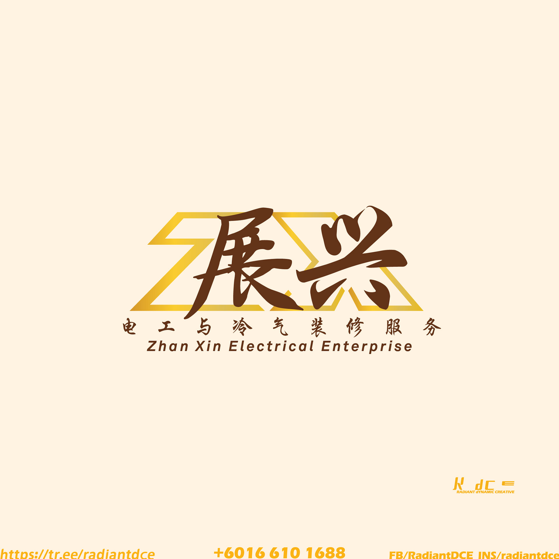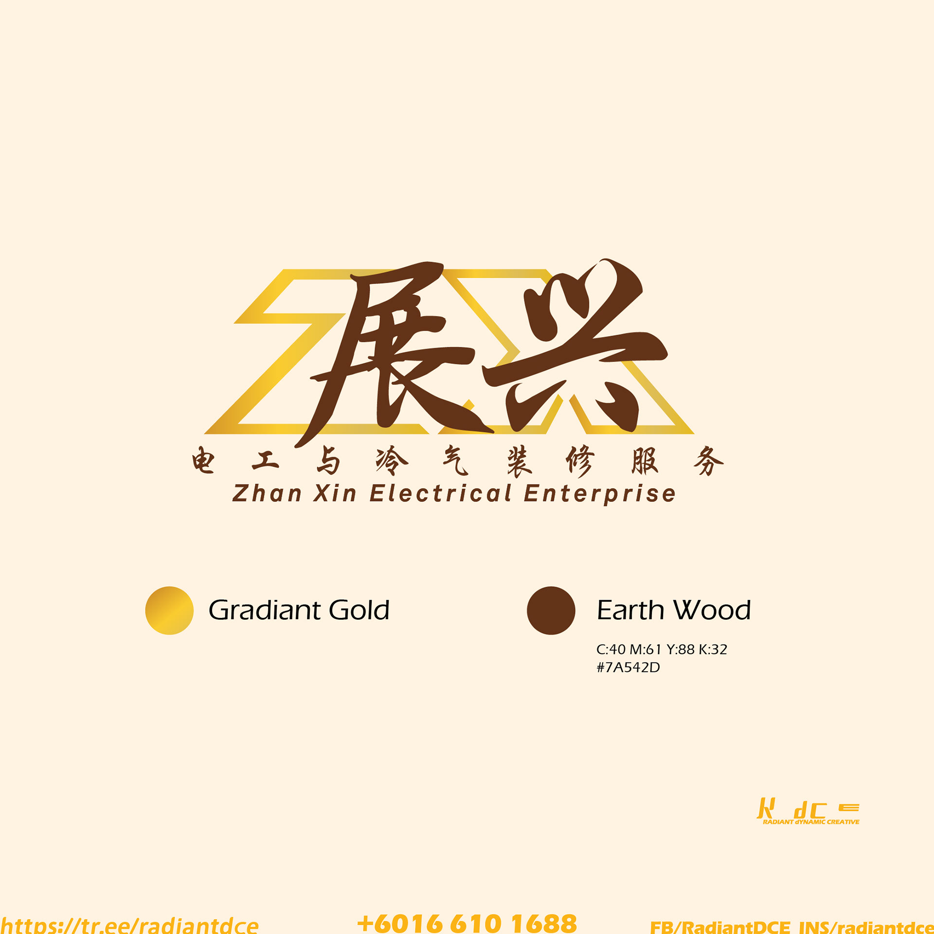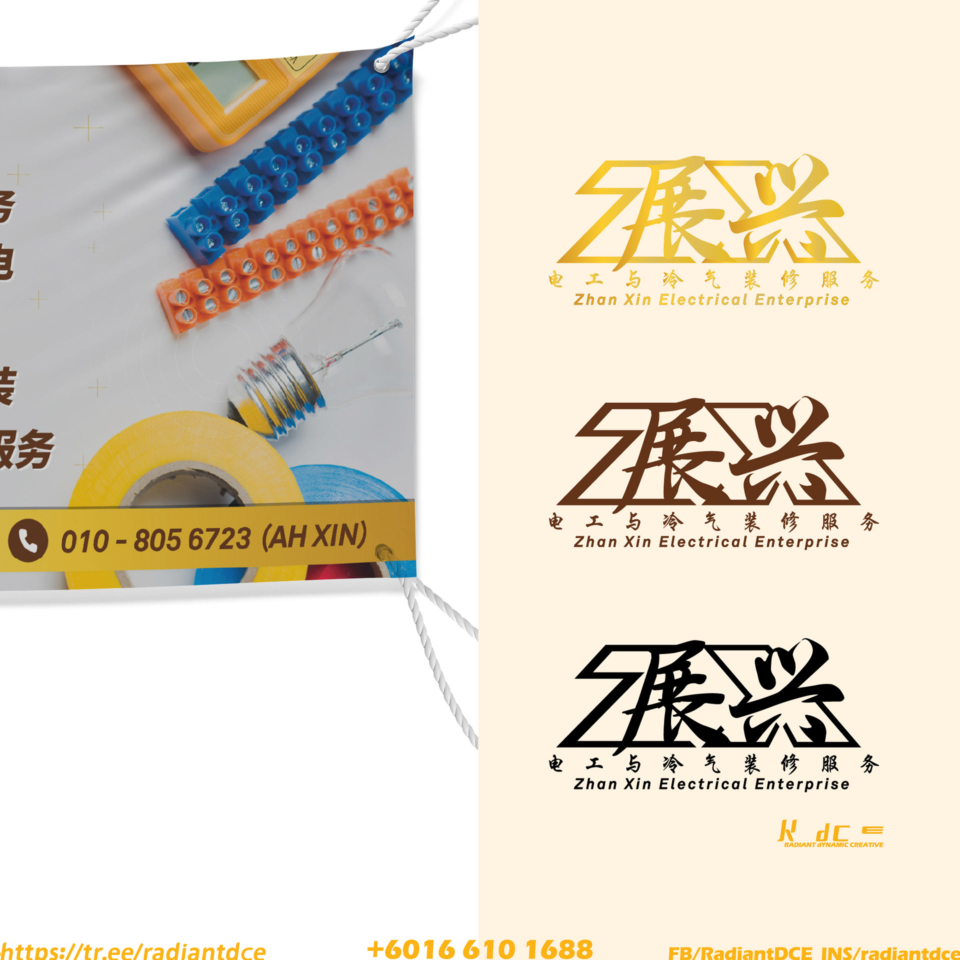
我们为【展兴电工与冷气装修服务】打造了全新的品牌形象。
Logo 以英文字母 “Z” 与 “X” 的结合为核心设计概念,象征“展兴”在事业上不断前进与延伸的力量。
品牌主色采用 红木色与金色 的搭配,不仅传达稳重与专业,更融合了风水能量的吉祥寓意,象征事业兴旺、财源广进。
整体视觉呈现简约而不失力量感,让人一眼感受到品牌在电工与冷气工程领域的可靠专业形象。
从标志结构到色彩应用,我们希望品牌在视觉上既能体现专业工艺,也能展现华人文化中的风水之美。
Branding Design — Zhan Xin Electrical Enterprise
For this project, we developed a fresh and distinctive identity for Zhan Xin Electrical & Air-Conditioning Renovation Services.
The logo design combines the letters “Z” and “X”, representing progress, expansion, and the steady growth of the company.
The color palette of mahogany red and gold reflects both professional reliability and auspicious feng shui harmony, symbolizing prosperity and success.